
Explore full information about the car models
Featured Vehicle Models / Latest Updates
New car models updated
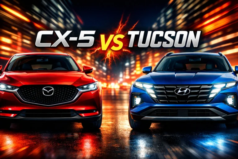
Mazda CX-5 vs Hyundai Tucson: the complete 2026 comparison for smart SUV buyers
If you're stuck choosing between the Mazda CX-5 vs Hyundai Tucson, you're not alone. I’ve tested, researched, and analyzed both...
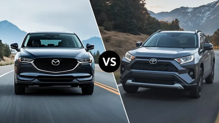
Mazda CX-5 vs Toyota RAV4: The Ultimate Compact SUV Showdown
Choosing between the Mazda CX-5 vs Toyota RAV4 is like trying to decide between a finely tailored suit and a...
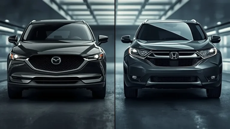
Mazda CX-5 vs Honda CR-V: The Ultimate Compact SUV Showdown
Are you standing in your driveway, staring at a blank space, wondering which silver or soul-red crossover belongs there? You...
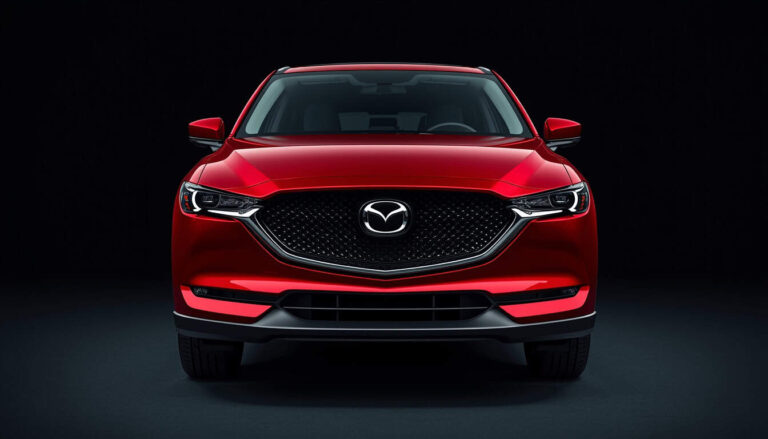
2026 Mazda CX-5 Complete Guide: Review, Reliability & Everything You Need to Know
Have you been eyeing a compact crossover SUV that doesn't compromise on driving pleasure? Let me introduce you to the...
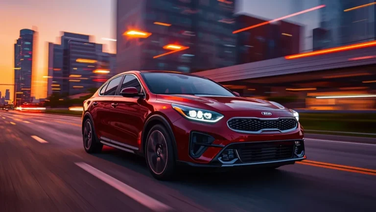
The 2026 Kia Forte Evolution: A Deep Dive into the All-New Kia K4
The automotive landscape is witnessing a seismic shift as the Kia Forte 2026 undergoes a total transformation, officially rebranding as...
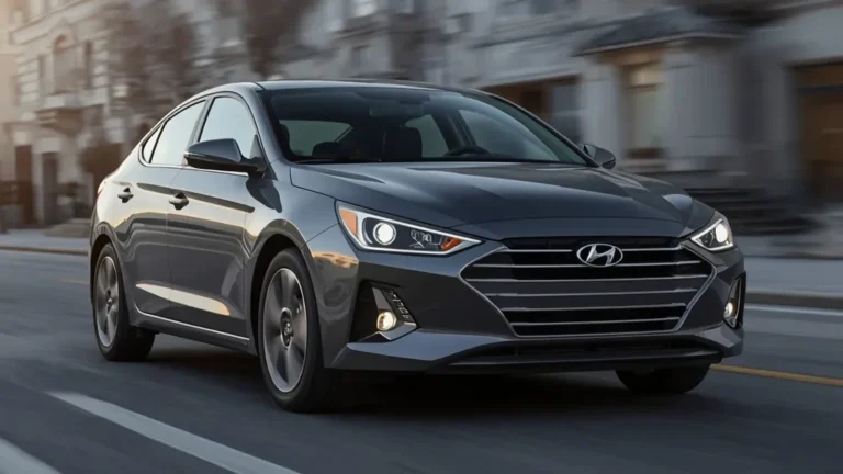
The Future Unveiled: Everything We Know About the Hyundai Elantra 2026
If you’ve been keeping an eye on the automotive horizon, you know that the Hyundai Elantra 2026 is one of...
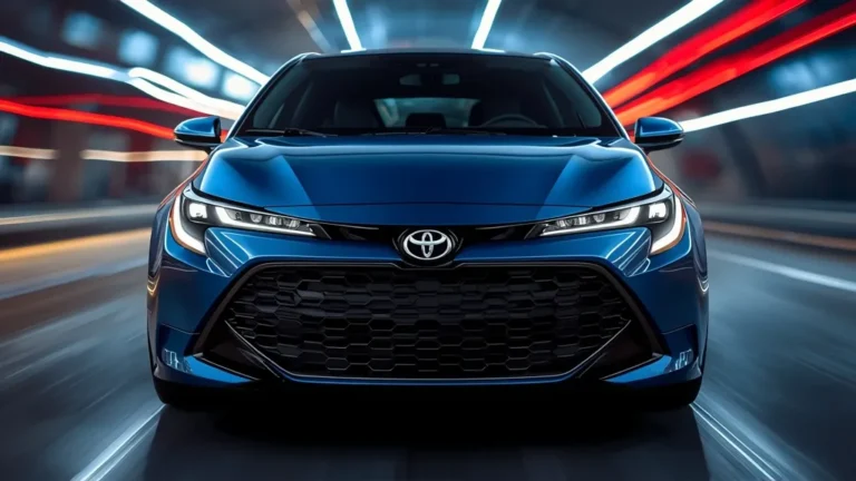
Unveiling the Future: What to Expect from the Toyota Corolla 2026
Have you ever wondered what happens when the world’s most reliable automotive icon decides to reinvent itself for a new...

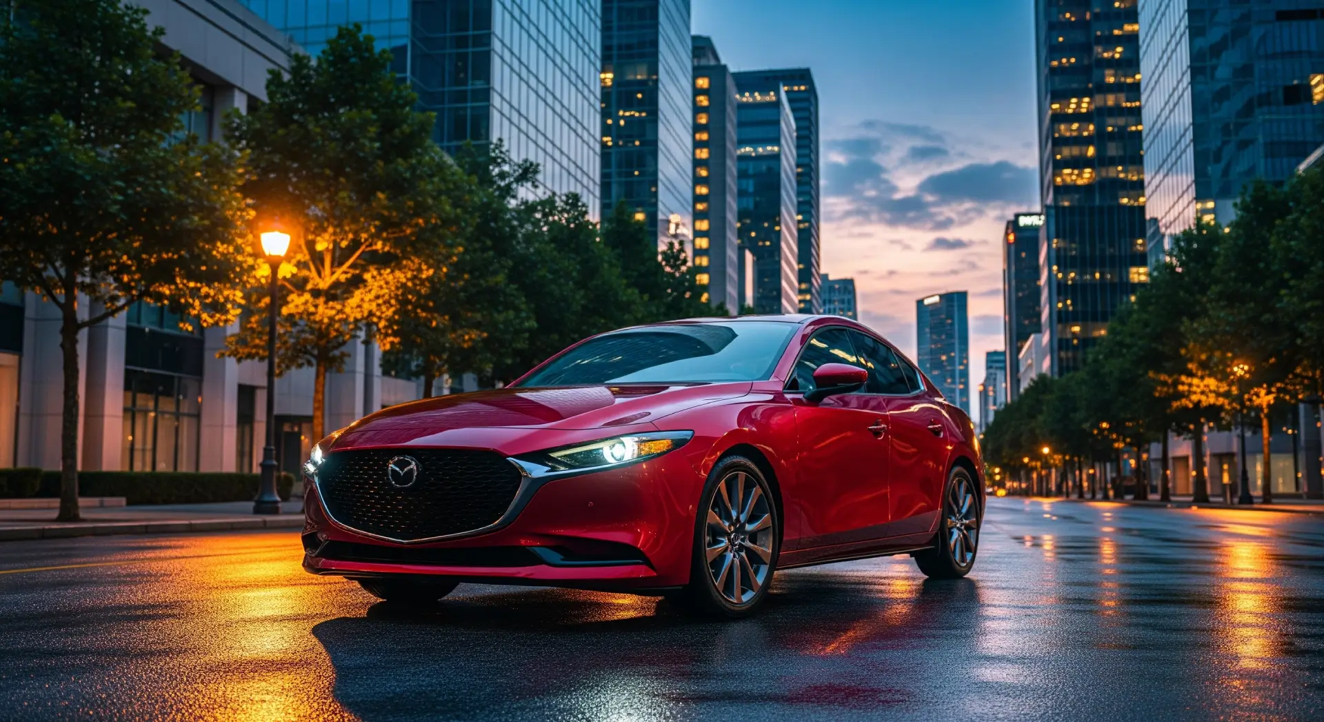
The Enduring Appeal of the 2017 Mazda 3: A Comprehensive Look for Used Car Buyers
The compact car segment is fiercely competitive, but what if you're looking for something more than just an A-to-B appliance?...

The Enduring Appeal of the 2009 Mazda 3: A Comprehensive Review
In the bustling landscape of compact cars, the 2009 Mazda 3 carved out a significant niche, earning a reputation for...
news and blogs
Toyota Doubles Down on USA: New $2 Billion Texas Plant Announced
Toyota plans a $2B investment in Texas to boost US production and create 2,000 jobs. See how this strategic move...
The Future of Maserati: Italian Design Meets Chinese EV Tech
Stellantis explores a partnership with Huawei and JAC Motors for Maserati's next-gen EVs. Will Italian design survive Chinese tech? Find...
May Madness: New VinFast, Peugeot, and RAM Models Set to Shake Up Vietnam’s Auto Market
From the new VinFast VF 8 to Peugeot and RAM, Vietnam's car market is buzzing. Discover the latest leaks and...
2026 Honda City Facelift Revealed: A Bold, Accord-Inspired Makeover
The 2026 Honda City facelift debuts a bold, Accord-inspired look and tech upgrades. Discover the new specs and launch date...
Honda’s Electric Ambitions Hit a Wall: First Annual Loss in Nearly 70 Years
Honda faces a massive loss due to EV costs and scraps ambitious electric targets. Discover how the giant is pivoting...
Vietnam Overhauls Traffic Laws: Is Decree 100 Gone? Here is What Every Driver Needs to Know
Decree 100 is gone, but penalties are rising! Discover how the new Decree 168 changes traffic fines in Vietnam. Stay...
Honda’s High-Stakes Gamble: Why Motorcycles are Rescuing the Brand from EV Losses
Honda faces its first loss in 70 years due to EV struggles. Discover how its motorcycle empire is keeping the...
The Price of Speed: Why Costa Rica’s EV Boom is a Warning Sign for the World
Costa Rica's rapid shift to cheap Chinese EVs is causing infrastructure chaos and import dependency. Discover the risks of uncontrolled...
Vietnam’s Pickup Truck Market: Navigating a Temporary Dip Toward a Bold Recovery
Vietnam's pickup truck market faces a temporary sales slump, but new regulations and EV entries spark hope. Explore the latest...
Will Aston Martin Become a Chinese Brand? The Fight for the Future of British Luxury Cars
Aston Martin faces a financial crisis, sparking rumors of a Geely takeover. Could this signal the end of UK car...