
Discover how Volvo’s new screen font enhances driver safety by improving readability on touchscreen displays. Learn more today!
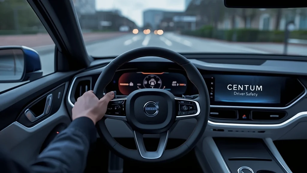
Volvo Cars has unveiled a brand‑new typeface designed exclusively for its in‑vehicle touchscreen displays. Named Volvo Centum, the font aims to help drivers read information at a glance, thereby enhancing overall road safety.
Why a New Font Matters
As modern cars replace physical buttons with large digital screens, the clarity of on‑screen text becomes critical. A well‑crafted font reduces visual “noise,” allowing the eyes to capture essential data without lingering on the display.
Design Secrets Behind Volvo Centum
Developed in partnership with renowned type‑foundry Dalton Maag, Volvo Centum was engineered for maximum legibility. Every curve, spacing, and character shape was fine‑tuned so that drivers can comprehend alerts, navigation cues, and climate‑control settings in a split second.
Safety Benefits
Volvo believes that a cleaner, easier‑to‑read interface shortens the time a driver’s eyes are off the road. While formal studies are pending, reduced glance time and clearer information presentation are proven factors that support safer driving.
First Appearance and Future Rollout
The new typeface will debut on the all‑electric EX60 – the upcoming counterpart to the popular XC60 – slated for launch in early 2026. Volvo plans to extend Volvo Centum across its entire model range, ensuring a consistent, safety‑focused experience worldwide.
Global Reach
Volvo Centum supports more than 800 languages, including complex scripts such as Chinese, Arabic, Japanese, and Korean. This multilingual capability is essential for a brand that sells vehicles in virtually every market.
Part of Volvo’s Proactive Safety Vision
Beyond its iconic safety reputation, Volvo is continuously evaluating the smallest details of the driver’s user interface. The introduction of a purpose‑built font illustrates how the company blends design, technology, and safety into every touchpoint.
Stay tuned as Volvo rolls out this subtle yet powerful change, proving that even a single typeface can contribute to safer roads.